8.29.2012

Seeing the Big Picture

Time for the next Right-Brain Business Plan exercise: Create a Big-Vision Collage.

"Thumb through your magazines and other material for images that evoke what you discovered in your vision. Cut or tear out pictures and words that represent the images and feelings you experienced." pg 38 Right-Brain Business Plan

"Once you've collected all your images, it's time to start grouping them." pg 39 Right-Brain Business Plan

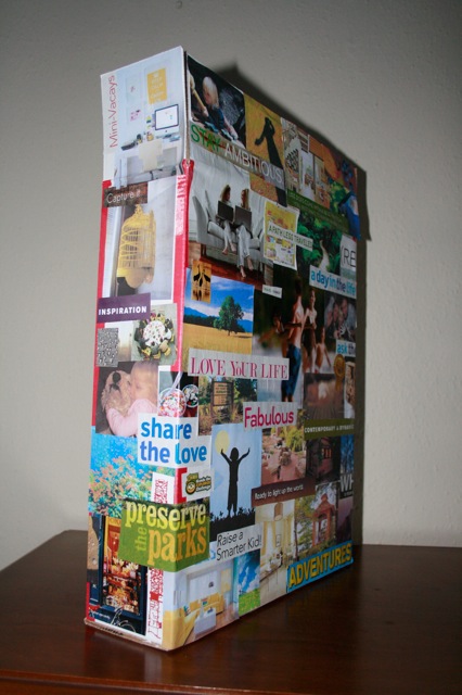
During the beginning of the year I completed this exercise. You can see what I created below.

Front: Company Overview
Right Side: Products & Services
Left Side: Getting the Word Out (Marketing)
Back: Creative Cohorts (top), Wealth & Abundance (middle) and Perfect Customers (bottom)


The start of The JMS Plan sits on my desk. This way I can be reminded of the big picture when I start to become overwhelmed by details.

My Big Vision Collage was created on the outside of an empty box with the hope that other elements of The JMS Plan will go inside.

8.27.2012

Rocky Mountain National Park’s 100th Anniversary Logo Contest

When a friend told me about a logo contest being put on by Rocky Mountain National Park I froze.

For about three weeks.

A successful logo takes time to create. Time doing research. Time sketching. Time digitizing your ideas. Time looking at type & color choices. And finally, time making revisions. Lots & lots of revisions.

Time I didn't *think* I had with a baby due at the end of June.

The week of my due date I set to work.

The Rules:

Logo must include the words:

Rocky Mountain National Park

1915-2015

Wilderness, Wildlife and Wonder **This slogan should be placed under the logo design, with the ability to remove it depending on the size & contextual use of the logo.

And the desired response of the winning logo needed to be:

Vision: Rocky Mountain National Park’s 100th Anniversary will encourage people to rediscover and reconnect with the wilderness, wildlife, and wonder that have inspired and continue to inspire visitors to Rocky Mountain National Park.

Mission: Rocky Mountain National Park’s 100th Anniversary honors our rich cultural and natural history and celebrates the wilderness, wildlife, and wonder that inspires people to experience, connect with, and protect Rocky Mountain National Park.

I ended up finding the time to create not one but three logo options for the contest. Take a look.


Big Horns Option


Mt Peak Option


Abstract 100 Option


The winner receives $3,000 & the opportunity to connect their work to a National Park. Just imagine how proud Ranger Roy will be if that designer is me?

8.22.2012

The Future

image from somewhere on the internet.

The first exercise I did out of the Right-Brain Business Plan book was the Dream Big with the Big-Vision Visualization. A mental exercise of looking into the future. Jenn provides you with a recording to listen to in a relaxed space while letting your minds eye "see" the future of your business.

"In this relaxed space, give yourself permission to let your imagination roam freely. There is no right or wrong here. As you listen to the guided meditation, you might have an epic vision filled with colorful details, or you may simply experience an inkling or a feeling." pgs 33-34 Right-Brain Business Plan

Notes from my visualization that I did back on January 8, 2012:

medium size room. large windows. large desk overlooking a garden. fireplace. modern community of clients. profits staying a step ahead of needed expenses. enjoying ebb & flow of children and work. inspirational & uplifting space & attitude. yellow curtains. gray walls. warm & inviting. leaving a legacy of teaching others to love nature. clients are people who appreciate well executed design, but can't always do it themselves. an assistant is hired. also in medium office. a different house? transparent. family. love. spend money on travel & food. a future award for my work. fuzzy. new products: more products focusing on nature for a wide age range.

---

After this visualization exercise I pushed forward with wanting to offer products dealing with nature & the outdoors. And I wanted to offer these products now. I put my heart & soul into preparing for a class I was scheduled to teach at Parkland College this summer called Day Hiking with your Family. I thought this was the direction God wanted me to go. Right now.

The class was cancelled due to low enrollment.

I was devastated.

Then my sweet husband, Jarrod, sent me a fitting post by Seth Godin called Getting serious about experimentation. A good reminder that doing your work successfully means failure will occur.

And I was gently reminded by God that I needed to have patience.

I picked myself up & moved forward.

One of the steps I've made while moving forward is to slow down to give myself time to complete the Right-Brain Business Plan for Jessie Marie Studio.

And Jarrod painted our kitchen yellow.

The Plan

Doors to Jessie Marie Studio, LLC will reopen to clients on September 4th. During my maternity leave I've used tidbits of stolen time to begin the process of creating a clear vision for the company. The tool I'm using for this refinement process is The Right-Brain Business Plan by Jennifer Lee.

This fall, you, my faithful audience, will get the privilege of seeing the vision unfold as I post my process here.

Now let's get started.

8.20.2012

A Baby Was Born

The Scheunemanns became a family of four on July 7, 2012. A little boy was born. The first week of his life his Mommy set to work creating his birth announcements.

Front of Card


Inside of Card


Oddly enough that was six weeks ago. Which makes it soon time to open Jessie Marie Studio's doors again.

Back of Card

6.19.2012

PMS 3255: Nautical

Color The property possessed by an object of producing different sensations on the eye as a result of the way it reflects or emits light. 

My eye is trained to see color differently than the normal person. When I was a prepress operator at OEC Graphics I would painstakingly color correct client's projects to print in the perfect mix of either spot or process colors. To accomplish this I had to "see" a small percentage difference from one hue of, say blue, to the next.

I later took my prepress knowledge into a graphic design position. I used my color trained eyes to find perfect combination of colors for product lines at Horizon Hobby. I'd use tools like Color Hunter & books on color in hope of finding a magic combination. But I found that my uber sensitive eye still needed to tweak the hues to perfection.

As you may have seen I used my uber sensitive eyes to create a perfect combination of color for our next baby. I'm not going to lie. The teal in the mix isn't in my normal list of favorites. Part of my issue is I don't like how the word teal sounds when you say it out loud.

Just say it, "TEAL"

And come on. Is it blue? Or is it green?

But I've now moved past all that.

I hesitantly added teal to the baby's brand. And therefore, into my life. Once I did I saw it magically used as an accent color on the house where we pick up our CSA food.


That door convinced me to repaint our changing table Nautical. (Way more fun to say than teal.)


And just yesterday, I designed our baby's thank you cards. Using PMS 3255 as the accent color.


Teal, welcome to my life.


6.05.2012

Branding My 2nd Baby

Like any good mother I want to be fair to my kids. This is why I have decided to once again go through the exercise of Branding My Baby.

First, a look at what was Cadence's brand. Two typefaces (LD Bohemian Filigree & Machiarge) & four neutral colors - slate blue, light brown, red & dark brown.


The type & the colors were used for Cadence's thank you cards & birth announcements. We also used the color scheme with a western rodeo theme for the nursery.

Well, Cadence turned out a bit - okay a lot - more girly than this look. Below is what Cadence overhauled her own brand into.


And now onto Branding My 2nd Baby.


Since this baby is getting 90% of Cadence's baby things handed down to him/her I decided to keep the Machiarge typeface. Sharing such a great typeface may be hard to do, but my kids will need to learn sharing is what siblings do.

Next, I bought My 2nd Baby it's very own display face: Skitch. I do realize normal moms buy their babies cute clothes. I buy cute typefaces. And this one is the epitome of cuteness. The typeface comes with multiple fun variations AND borders and ornaments. Perfect for designing this child's thank you cards & birth announcements.

As for the color palette, I'm giving My 2nd Baby's brand flexibility. I've kept the same dark brown that was used for Cadence (another lesson in sharing) & added a light gray, sea foam green, and then chose a gender specific color - blue for a boy or pink for a girl.

The inspiration for both the type & color scheme came from the photo below, little birds, by Leslie Ostrander that we purchased for the new nursery. The photo was part of our prize for supporting her new book the pauses between due out in August.